Giving ideas an identity.
BRANDING
Hub College Park
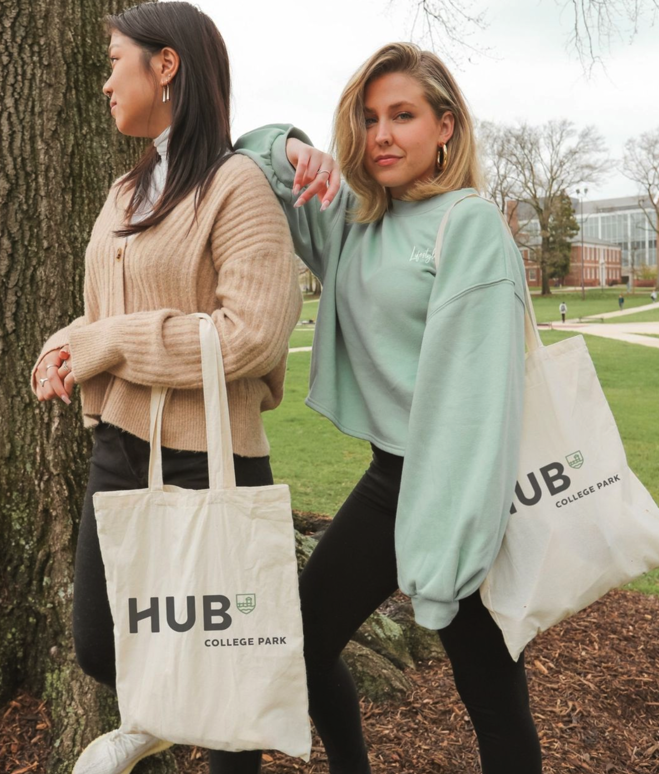
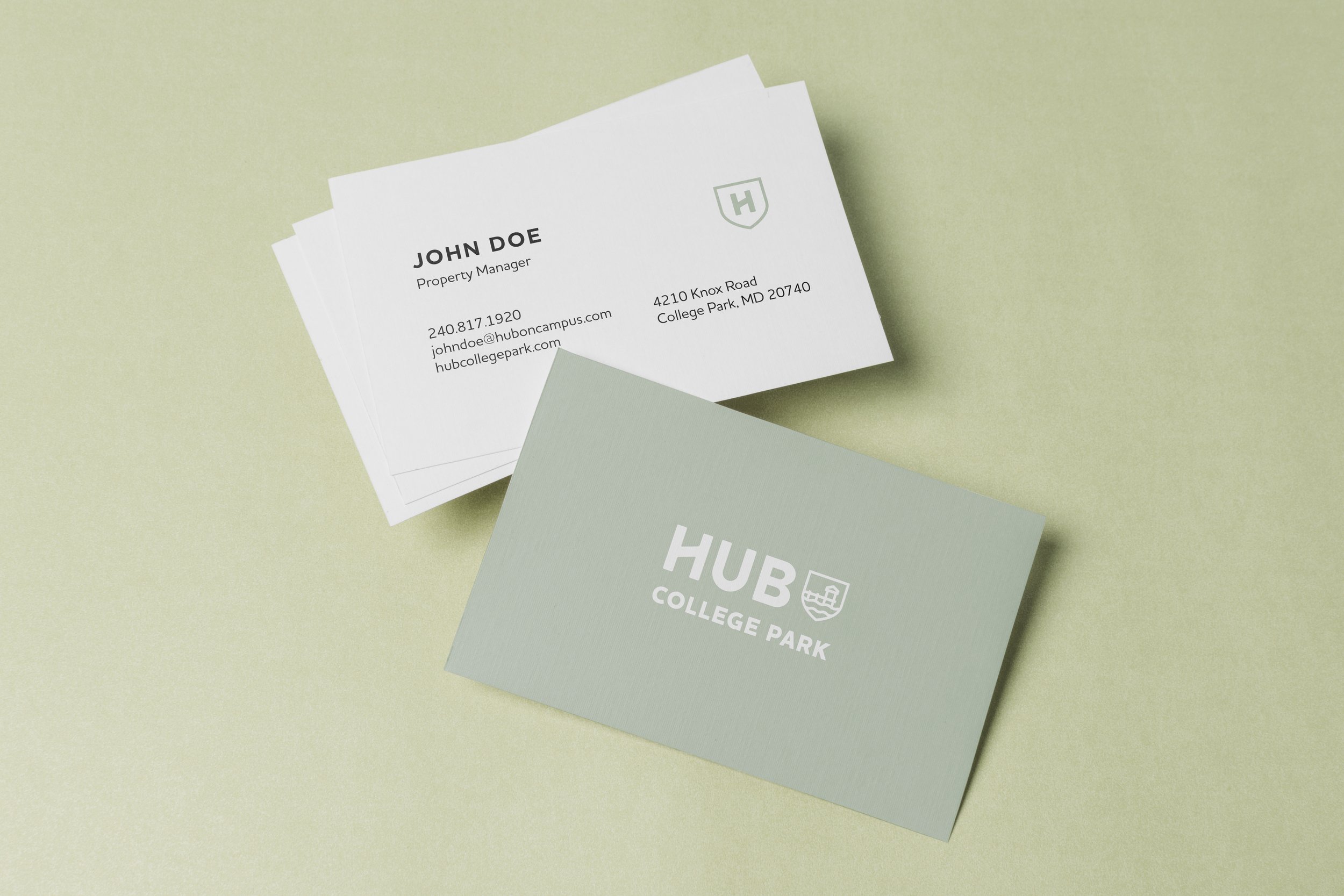
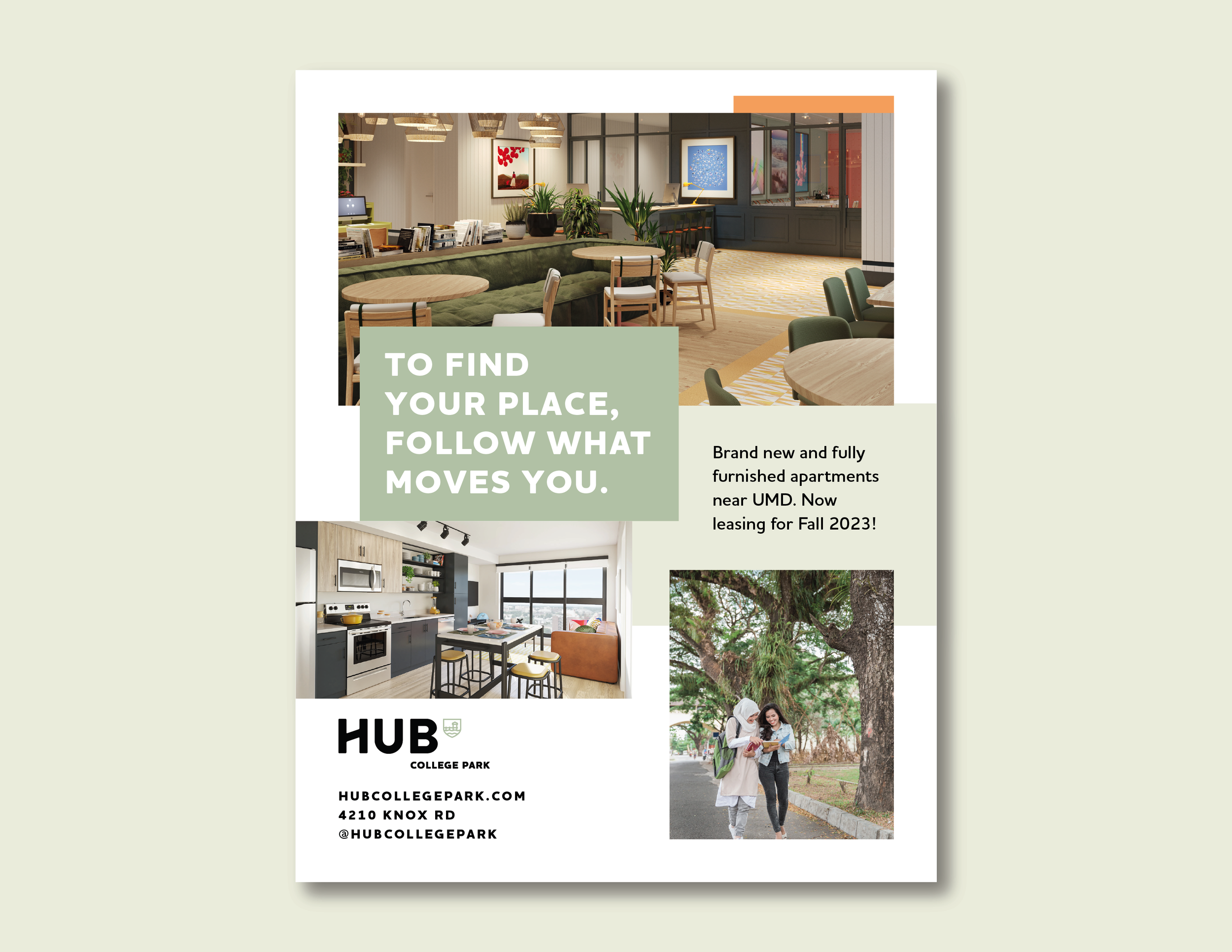
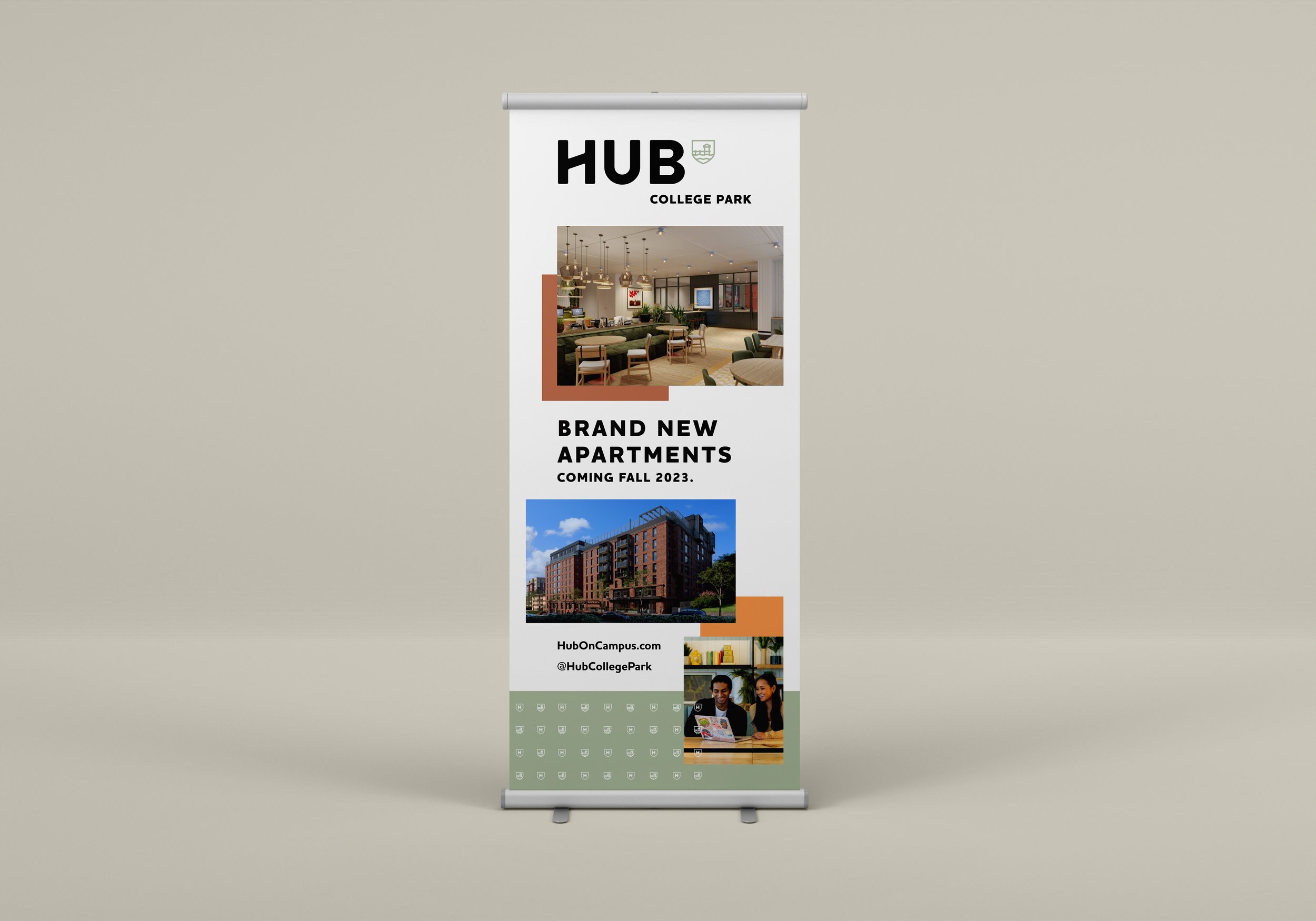
“Hub” is Core Space’s original brand - it’s bread and butter. Each student housing building in the Hub brand has an individualized shield logo and its own colors. Using the brand’s simple and bold line drawing style, I depicted a dock for our College Park property to convey the relaxed feel of the property. The selected colors reinforce this idea with easy, natural tones and an unexpected bright orange, to maintain a youthful impression. I have interpreted this brand onto a range of collateral, from large scale window wraps to social media stories.




oLiv Auburn
Core Space’s other dominant student housing brand, “Oliv” is targeted at grad students and young professionals. Each property within this brand has a unique set of 6 colors that reflect the community. With Oliv Auburn’s colors, I wanted to build a palette that felt full of life, but elevated. With colors established, I have interpreted the Oliv brand onto a breadth of collateral seen below.
Grace Kids
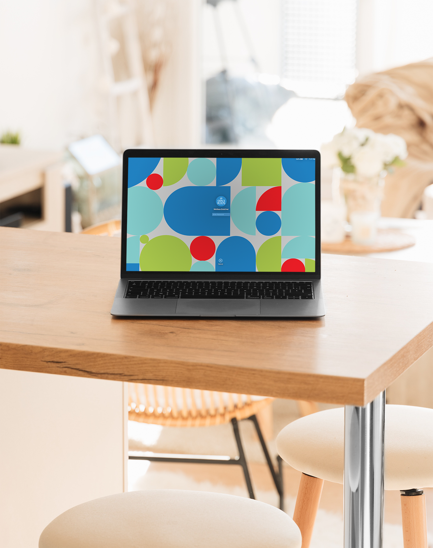
During my time at Grace Covenant Church, I was tasked with rebranding the children’s ministry. The goal of this rebrand was to pose Grace Kids as an extension of the overall Grace brand. I did this by reinterpreting Grace’s logo of the crown in a more playful way. The typeface and icon style use rounded corners and the bold color and geometric nature of the shapes feel friendly and approachable. Grace Kids includes children from birth to fifth grade, so the rebrand presented the challenge of covering a broad range of ages. The brand is energetic, fresh, and kid-friendly, without being "baby".





Summer Fest
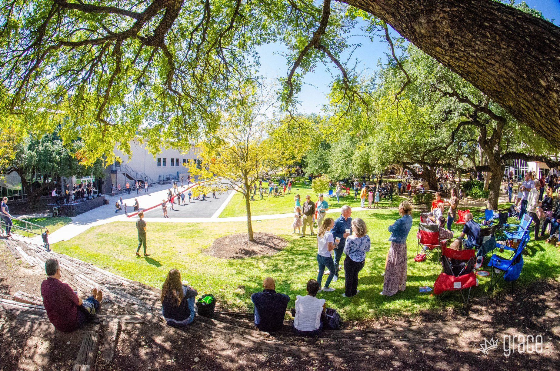
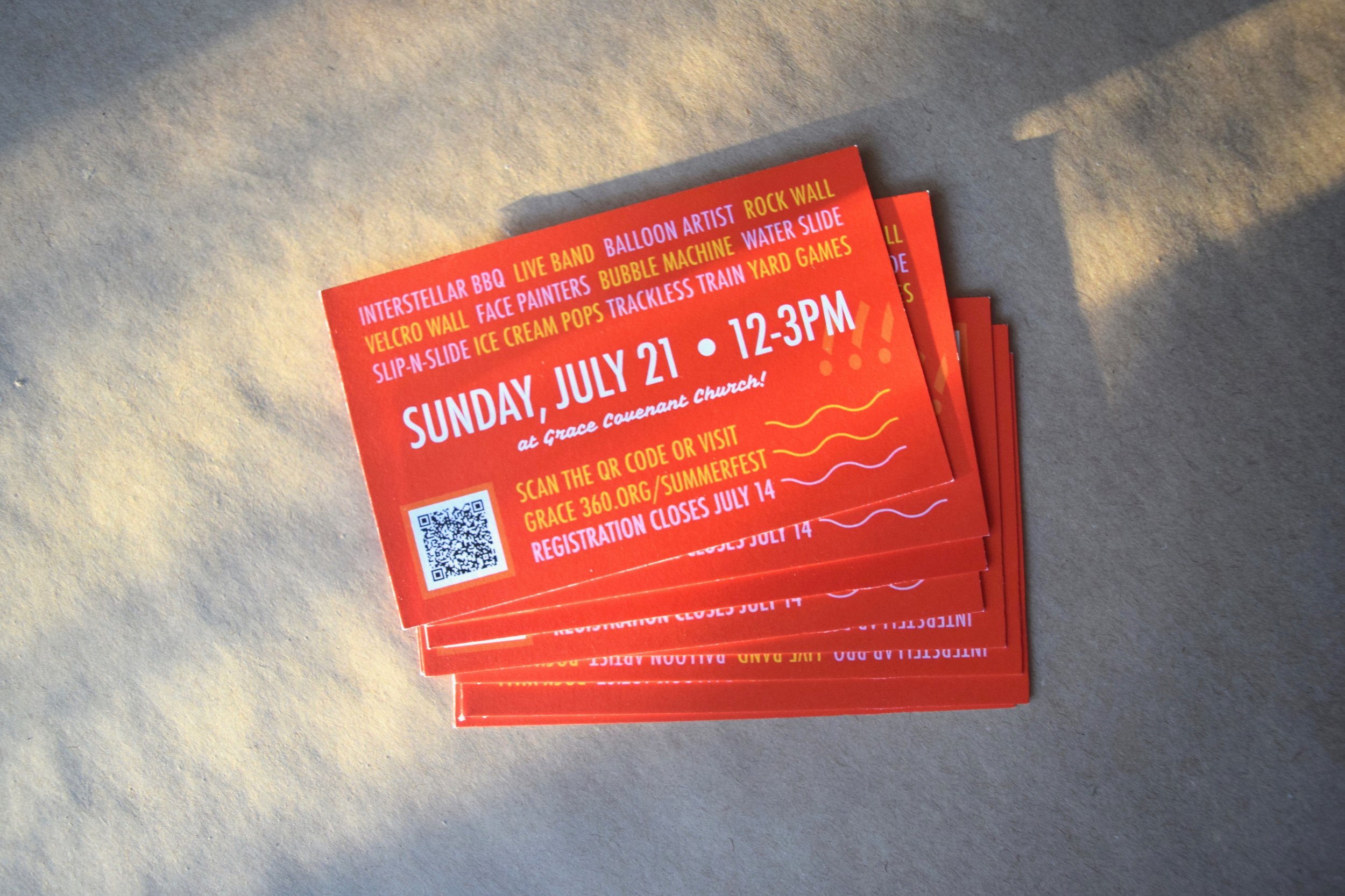
At Grace Covenant Church, the annual Summer Fest event rings in the summer and provides church-members an opportunity to spend time with their church family. With over 1,000 people attending the event, Summer Fest demands a wide scope of promotional and way-finding materials. The intention of the event-was to reference festival design looks while maintaining a candid and family friendly tone.


